


The entire layout is built upon a strong, asymmetrical grid system reminiscent of De Stijl art. These lines define the primary structure and flow. Think of them not as static boxes, but as channels that direct the user's eye across the page. The grid ensures order, rhythm, and a clear hierarchy, much like a river system carves paths through a landscape.
Content Blocks as Land and Water: The rectangular spaces created by the grid are the heart of the content. We transform these areas into solid blocks of color or defined zones for text, imagery, and interactive elements.
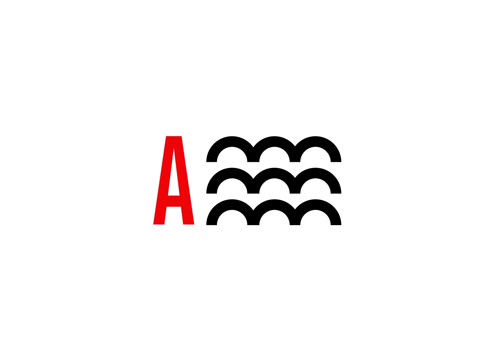
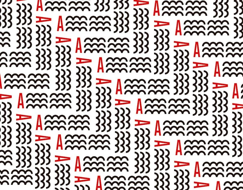
Color Areas: Vibrant primary colors (red, yellow, blue) alongside black and white are used to create visual weight, draw attention, and establish a bold, confident aesthetic. These are our landmarks.
Information Areas: These are quiet, neutral spaces (often white or light grey) where typography and data are presented with clarity and focus. They are the inhabited parts of our city.The brand lays in the concept “The city of the thousand rivers”

#Branding #Social Media #MotionGraphics #Animation #Mockups #ImageTreatment #Illustration #ArtDirection