Ofertón:
The rise and hype of the “Super 24h”


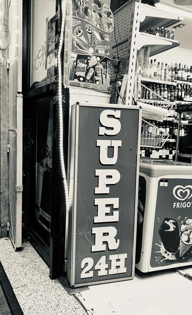
The Observation: Barcelona's neighborhoods are undergoing a rapid transformation. As they grow in popularity, a new commercial landscape emerges: the ubiquitous "Super 24h" convenience store. These shops, characterized by their fluorescent lighting and inflated prices, are becoming a symbol of a city catering to transient tourism at the expense of local character. They represent a hollow promise of convenience, an "Ofertón" (a supposed great deal) that actually signifies the erosion of authentic city life.
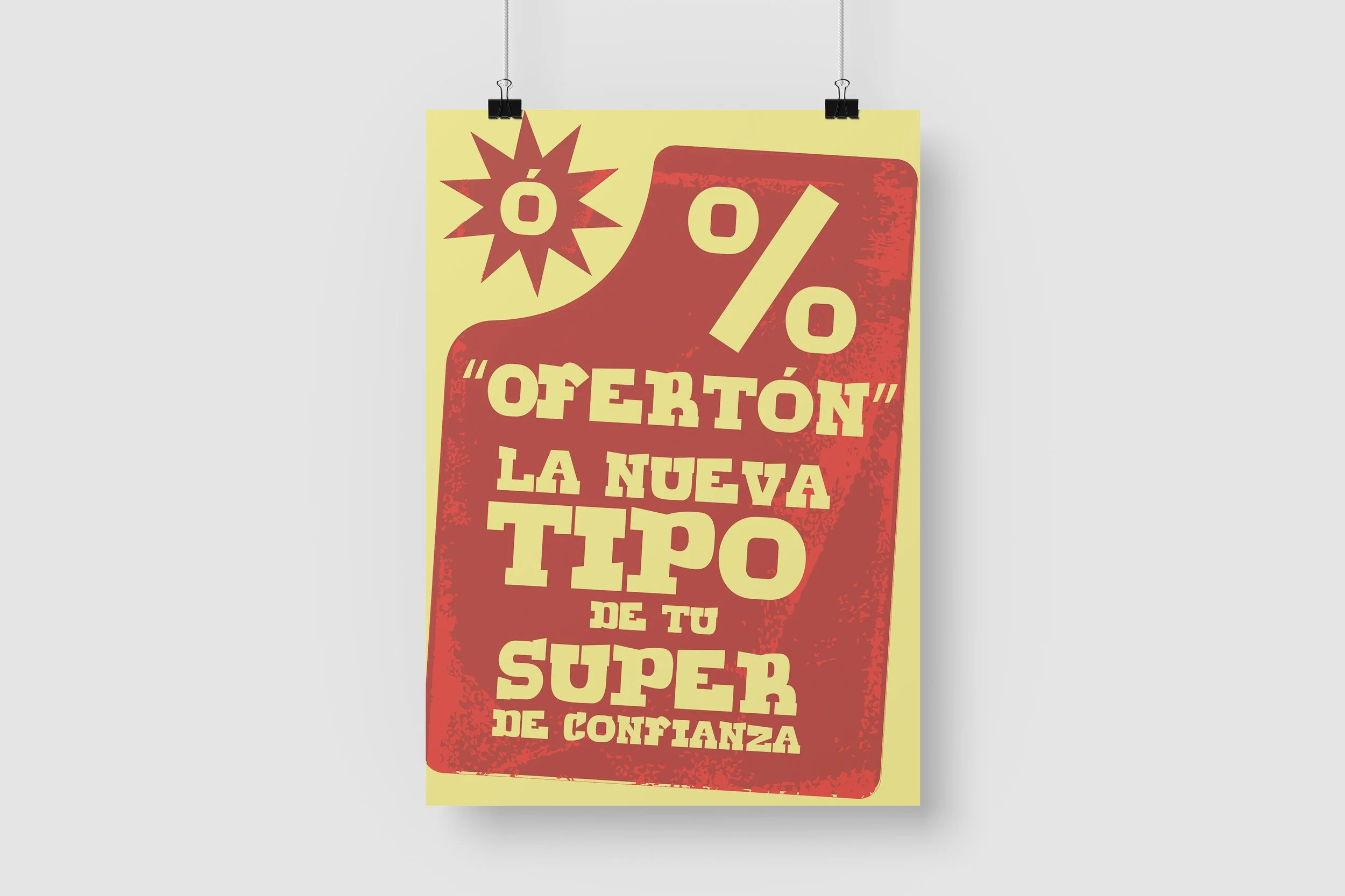
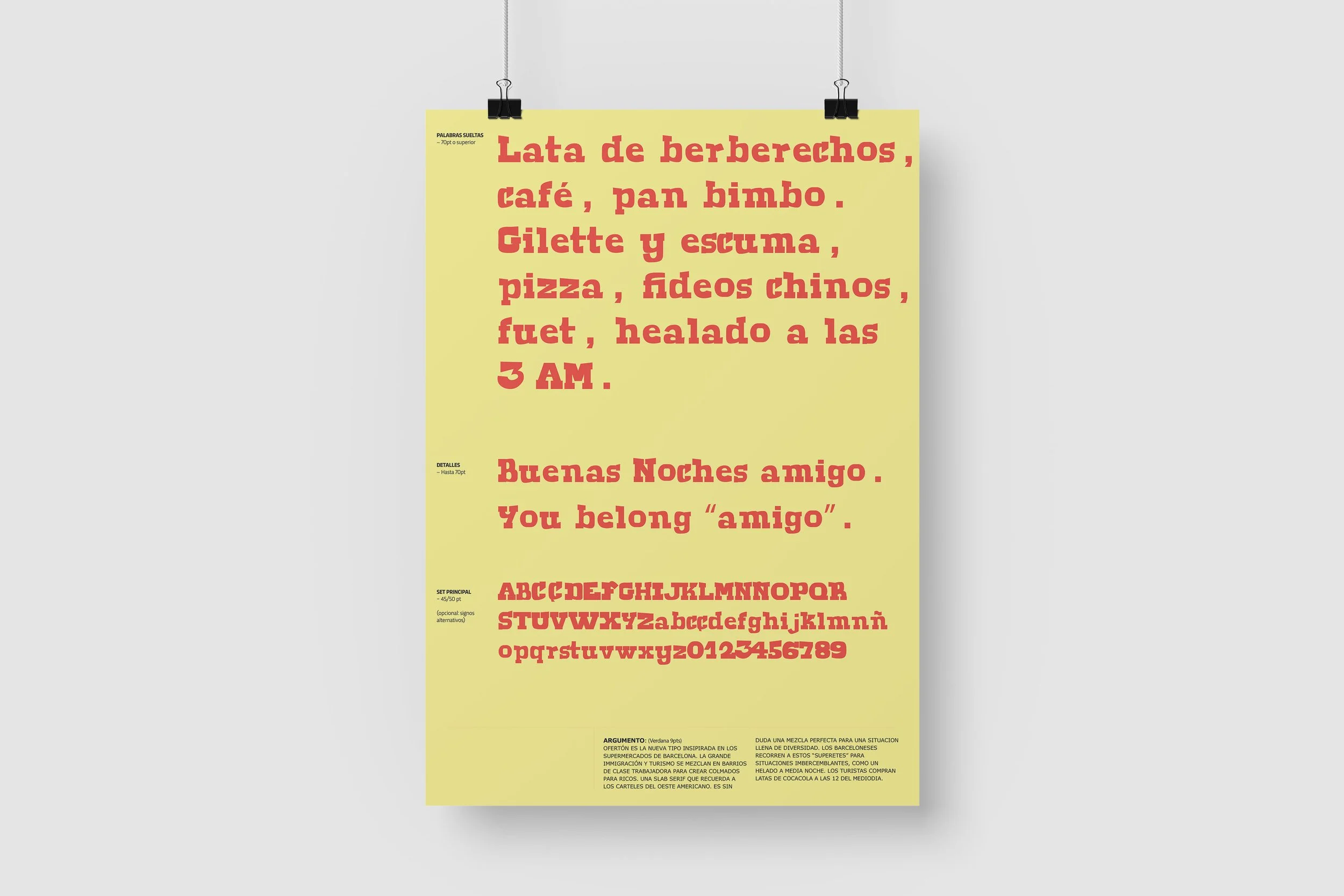
The Concept: "Ofertón" is a typeface that serves as a direct critique of this phenomenon. The project's core idea is to use the visual language of the past to comment on the present. Instead of creating a modern, sterile font that might mimic these new stores, I chose to document and digitize what is being lost.
The Typographic Execution: The design is a direct imitation of the vernacular slab serif typography found on the historic façades of Barcelona's traditional "brick and mortar" businesses—the bakeries, hardware stores, and small bodegas that are slowly disappearing. These letterforms are sturdy, imperfect, and full of character, embodying a sense of permanence and craft.
The Critique: The critique lies in the ironic juxtaposition. By capturing the soul of these legacy shops in a typeface and naming it "Ofertón," the font becomes a satirical tool. When used to write the names and slogans of the very 24/7 stores that replace them, it creates a visual paradox. It's a typeface that looks like authentic, charming Barcelona, but speaks the language of gentrification and commercial opportunism.
"Ofertón" is more than a font; it's a piece of visual commentary that asks us to consider the true price of convenience and the cultural cost of a city's hype.


#Experimental #Typography #Branding #Animation #Mockups #Illustration

